Retro Rebrand for In Context
In Context, Inc., helps digitally inexperienced business owners with their content marketing by giving them a framework to build their presence online. After several years in business, CEO and owner, JC Cheney, knew the brand needed a change.
A Little Background
In Context has been serving small businesses for nearly 7 years. Their services have evolved over time, but the focus has always been the same – to offer accessible, supportive services to businesses as they grew their online presence. Unfortunately, their brand did not represent the level of service they were providing.
Why a Rebrand?
When JC reached out, they had a few goals in mind:
- Establish a Brand Framework They wanted to clarify their mission, vision, values, and brand promise so they could fine-tune their marketing efforts with the right audience.
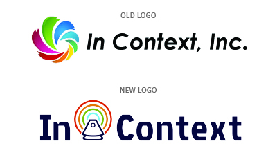
- Get a Fresh Logo and Look JC wanted new assets that aligned with their brand voice, would grab the attention of their audience, and if possible, be in a retro style.
- Stay Consistent JC wanted to be sure their team could keep the new logo and brand assets looking good at every touchpoint.

Odvant’s Brand Process
Although we had known In Context for several years, we still took some time to get to know more about the business.
- Brand Framework
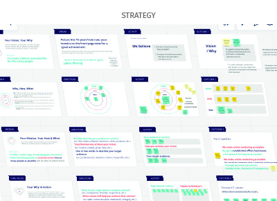
We guided the In Context team through exercises and discussions to explore their Why, How and What (Simon Sinek inspired). Then we refined their mission, vision, values, and brand promise. It was especially important that we communicated their authenticity, connection, and compassion. This part of the process often felt like brand therapy. JC was grateful to have the time to deep-dive into their brand to get to the heart of why they do what they do. - Visual Identity
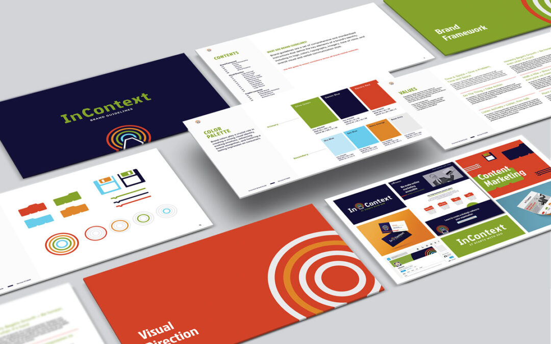
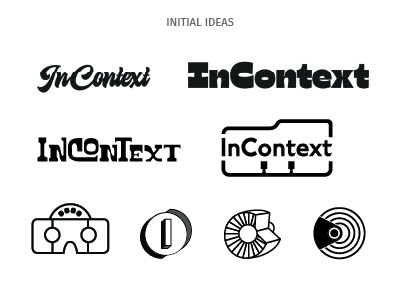
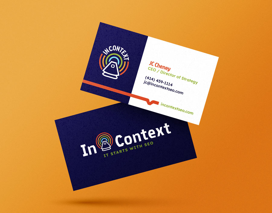
Lucky for us, JC and their team were not afraid of color! They wanted a retro vibe for the Gen X and above crowd. Our readers over 40 years old may remember the Rolodex (they’re still around!), which inspired the look of the logo and many icons. It was a great jumping off point that led to a fun, funky brand with a lot of lively assets. - Brand Style Guide & Marketing Materials
What’s the point of having a shiny new brand if no one knows how to use it? Although we are always happy to help our clients with any further design needs, we often handover the brand to an in-house team. That was the case with In Context. We created a detailed style guide that included their Brand Framework and how to use the visual brand correctly. We also created a business card and a few other materials to get the brand started.
The Results
In Context has taken the brand to a new level. Now they look fresh, cohesive, consistent, and best of all, they love their new brand!
By focusing on not just a new logo, but also a brand framework and complete branded look, In Context can confidently market to their target audiences.
Are you interested in rebranding your business or organization? Get in touch.

