I am all about rebranding.
It’s what I do for a living. As organizations evolve, grow, change their products, or have a better understanding of what they are offering, a brand refresh is a must.
Sometimes that means changing or modifying a logo.
But, not always.
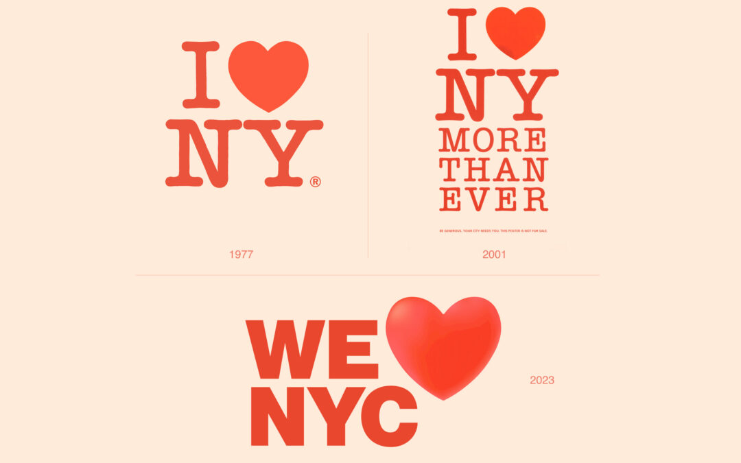
NYC is launching a new campaign to encourage New Yorkers to come together and help their city from the ground up. They modified the iconic I❤️NY logo created by Milton Glaser in 1977 to create a new WE❤️NYC (or WE NYC❤️ depending on how you read it).
Unfortunately, this new modern version lacks the charm, grit, and personality of the original logo. In 2001, when Milton Glaser modified it to reflect the city’s pain after 9/11, he didn’t try to modernize or make it sleeker. He kept it familiar and simple.
The original logo has a valuable emotional connection that was thrown to the side to create a “modern” logo. What a waste of that brand capital.
This is exactly how many New Yorkers feel; their unique neighborhoods are being taken over by sleeker chain stores and restaurants. People who have lived in NYC their entire lives are being priced out of their own neighborhoods.
The personality of the city is being replaced. That’s exactly what this logo represents.
But, maybe this new logo succeeded in bringing New Yorkers together….to hate on this logo.
What do you think? What is your opinion on the 2023 version?