Blue Ribbon Organics
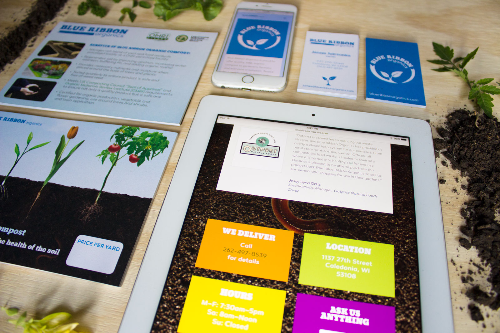
New Name, Same Farmers
The Farm’s Compost came to us when going through a company name change. They wanted to expand to more organic products, outside of the compost they were currently selling. We loved the challenge of helping pick new name ideas. We got to work with them firsthand to see what makes them unique. We found a lot of great things to put into the new brand.
Project Details
Client Blue Ribbon Organics
Date Spring 2016
Skills Brand Strategy, Brand Development,
Web Developement
Site BlueRibbonOrganics.com
Show Off the Cycle
Blue Ribbon Organics has a process that competitors just can’t compete with. They get unsold produce from grocery stores and put that right into their new compost rows. After going through a highly calculated process, the compost goes back to the grocery store to sell to customers. They wanted a logo that reflects their process, that is so unique to them. Not all compost companies get to work so closely with the community like they do. They’re basically a big deal.
Keep it Simple
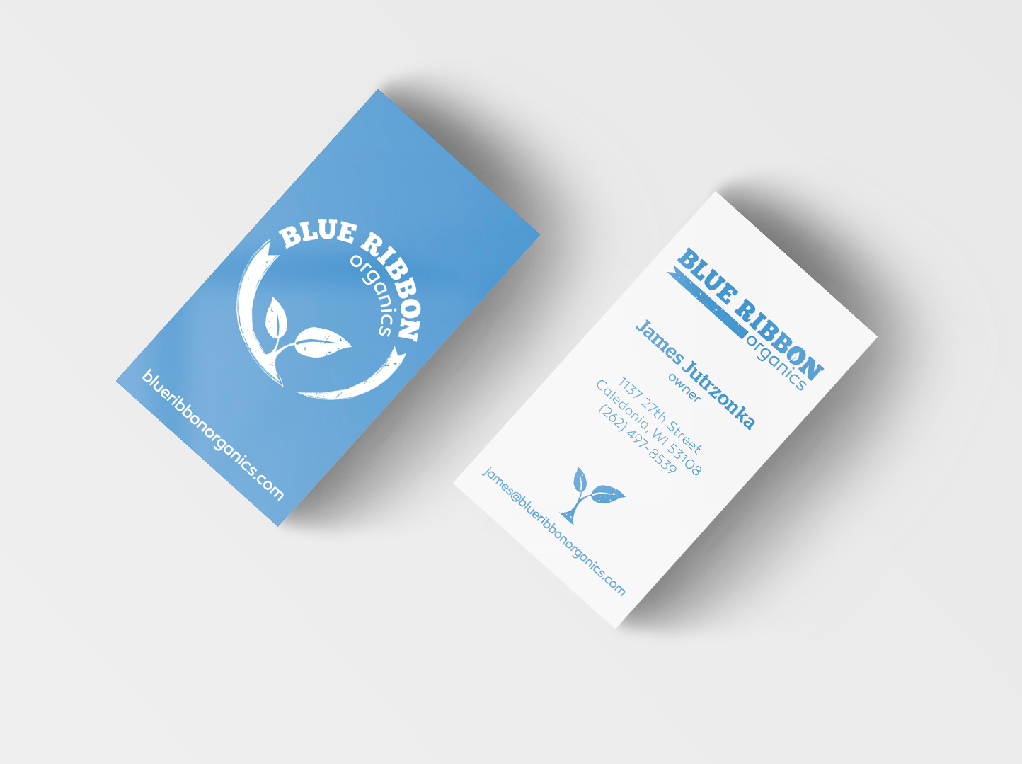
We developed their brand to have a lot of white paired with pops of blue to let the logo shine. Blue Ribbon’s customers are busy people and need to know contact info fast. This business card gives you that info at a quick glance with this clear and non-cluttered design.
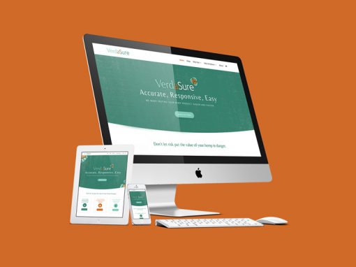
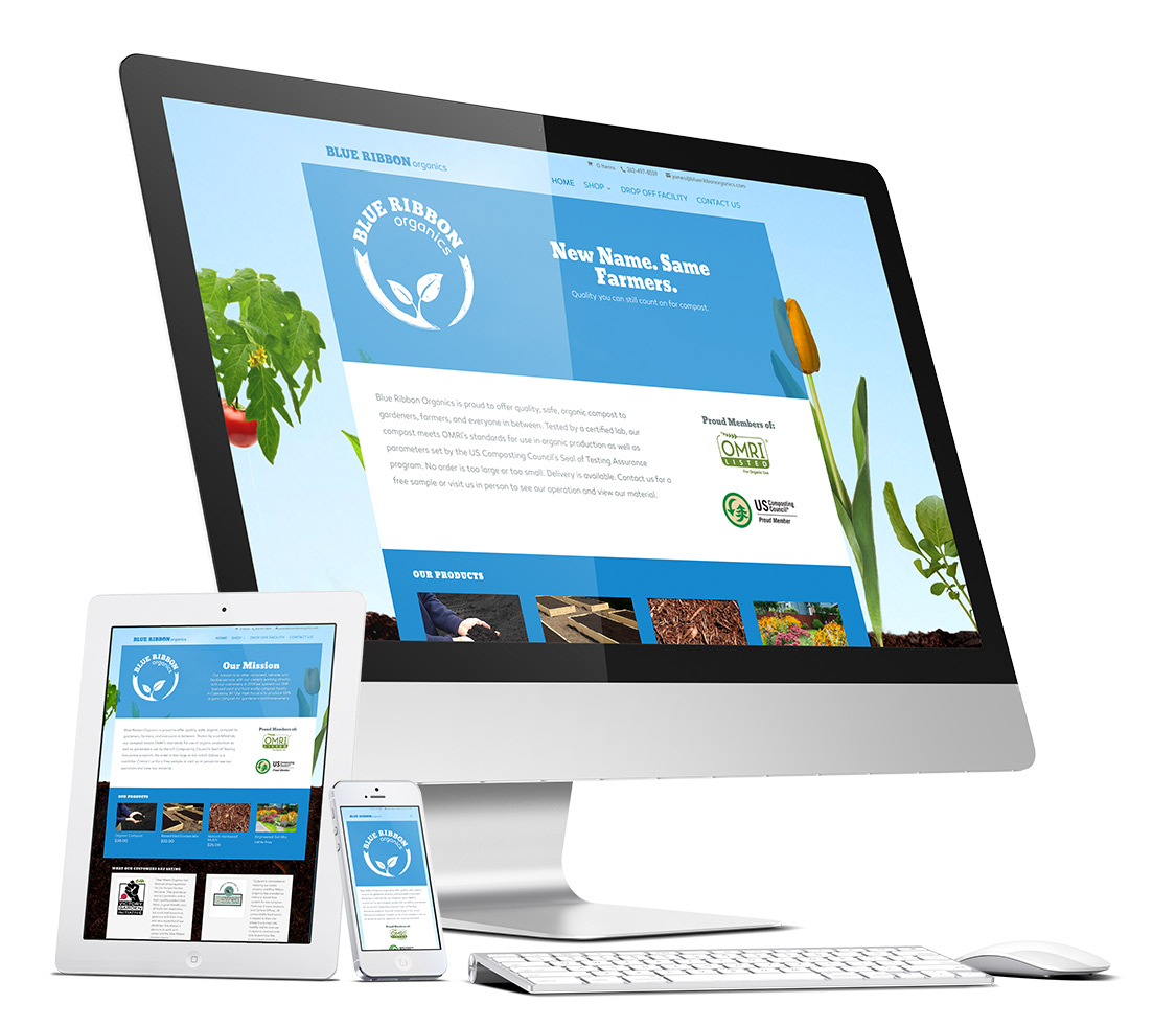
A Site That Gets The Job Done
After knowing more about the business, we realized lots of things we could transfer to the website. It made sense to have the website do more tasks so the workers would have less paperwork and more time on the grounds. The new website takes online orders, streamlines product questions, and is completely mobile friendly.
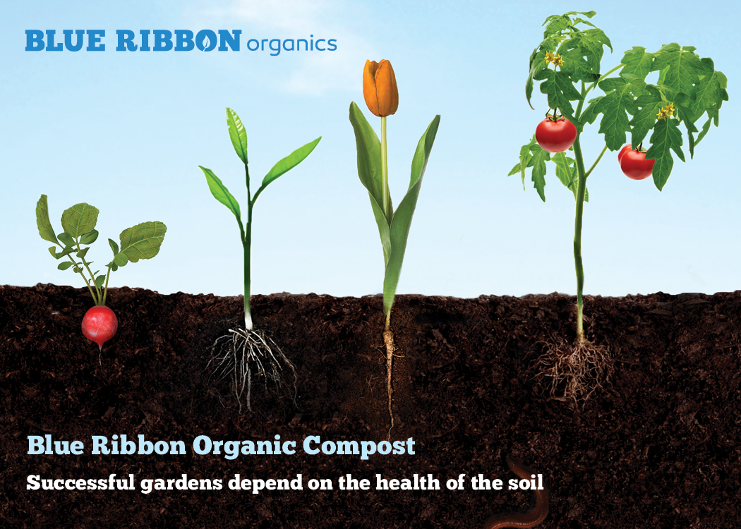
A Brand That Lasts.
We carried the cycle idea all the way from the logo, to the website, to the imagery related to the brand. We created a custom photography treatment to show plants from above ground to below in the companies compost. The treatment is flexible and can be updated for different seasons.
see more of our work